Target Audience: Spice lovers and home cooks craving bold, zesty, and globally inspired heat experiences.
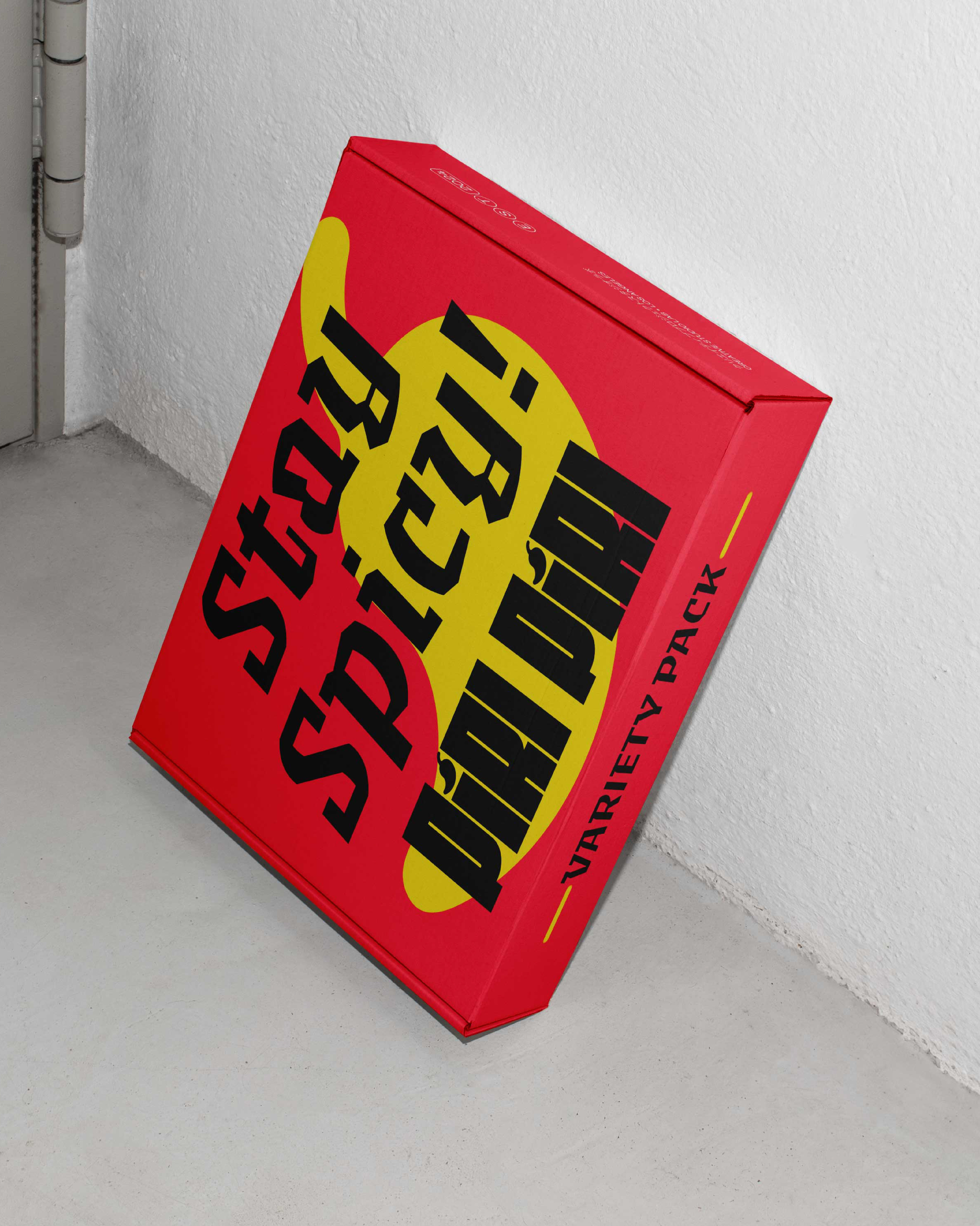
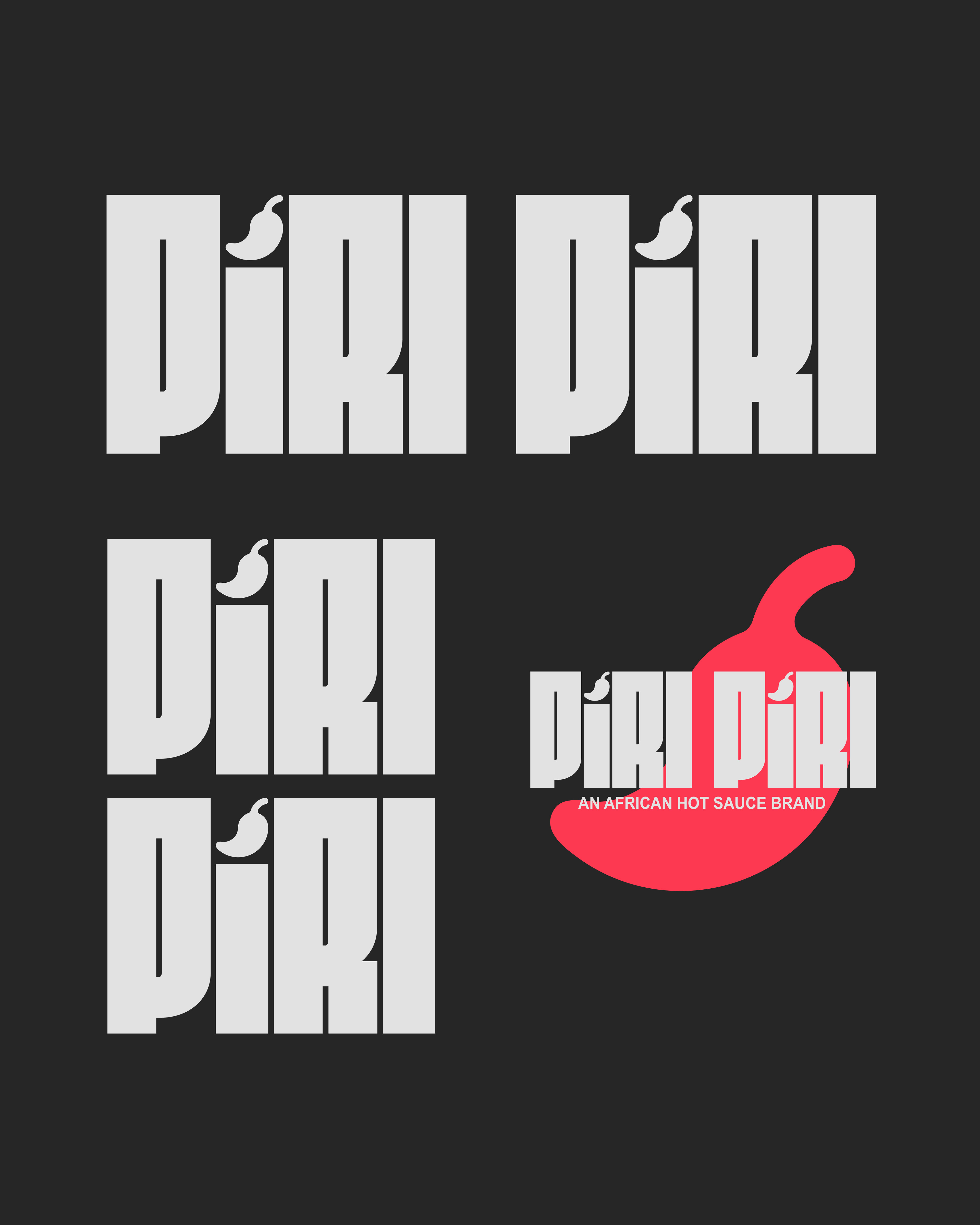
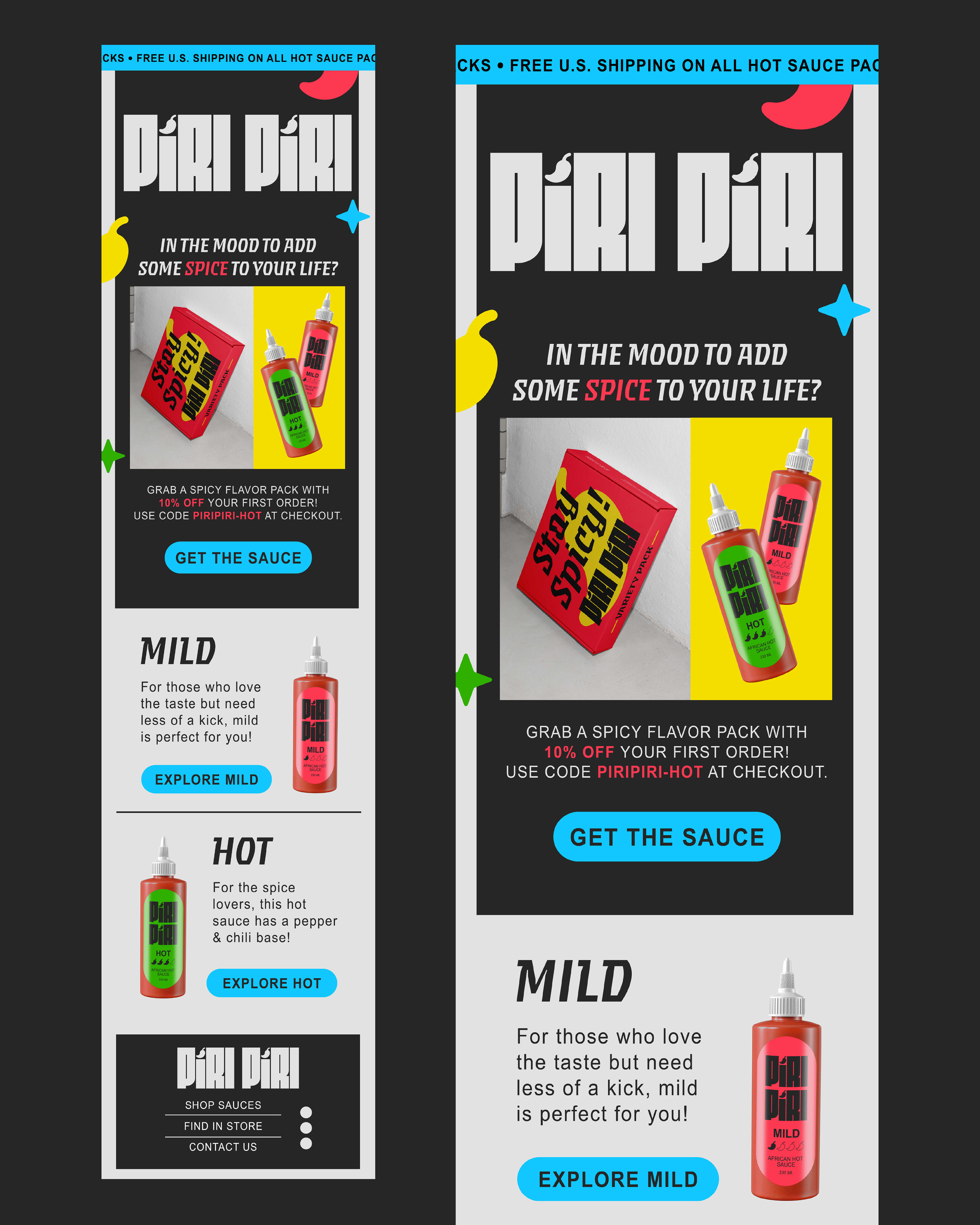
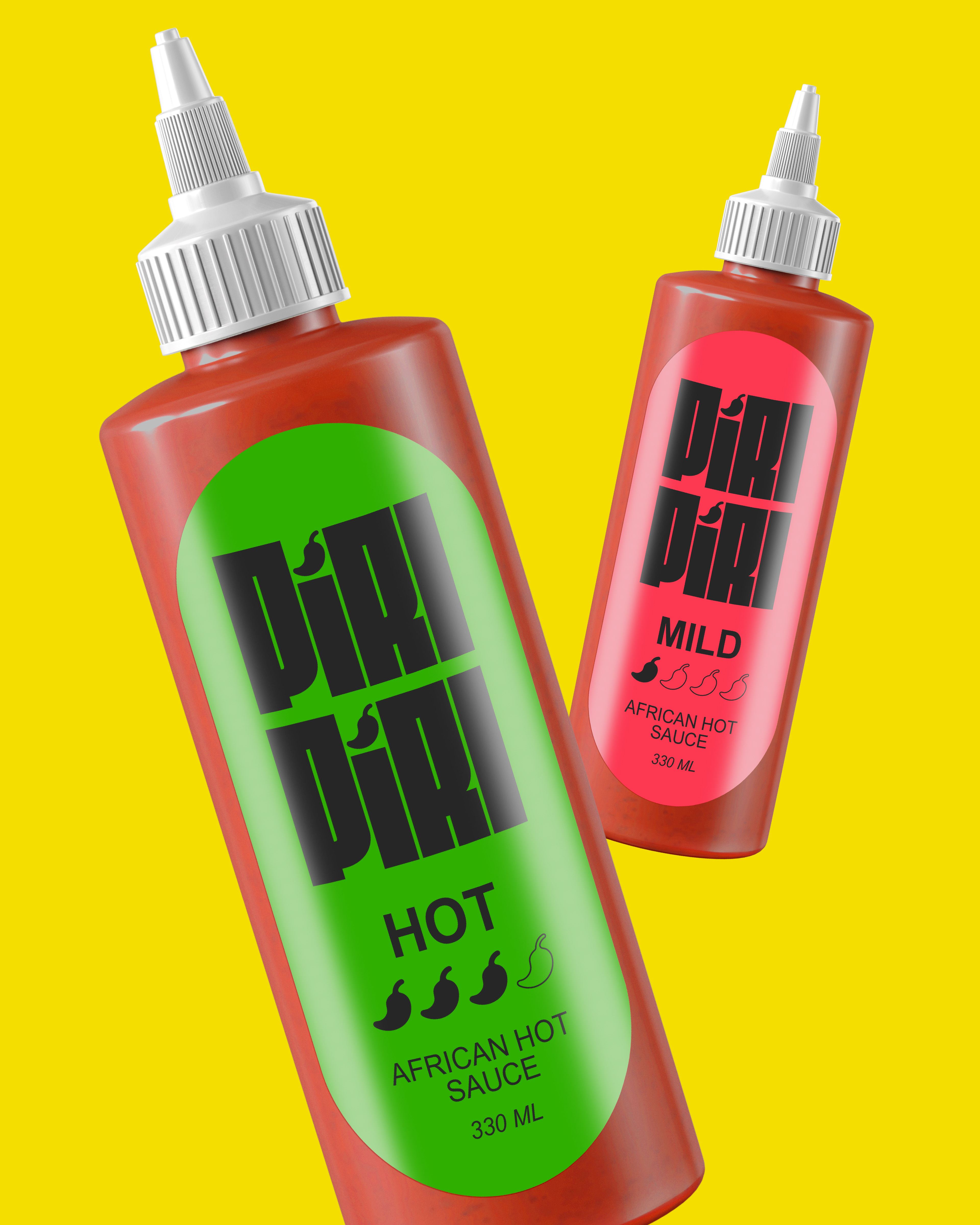
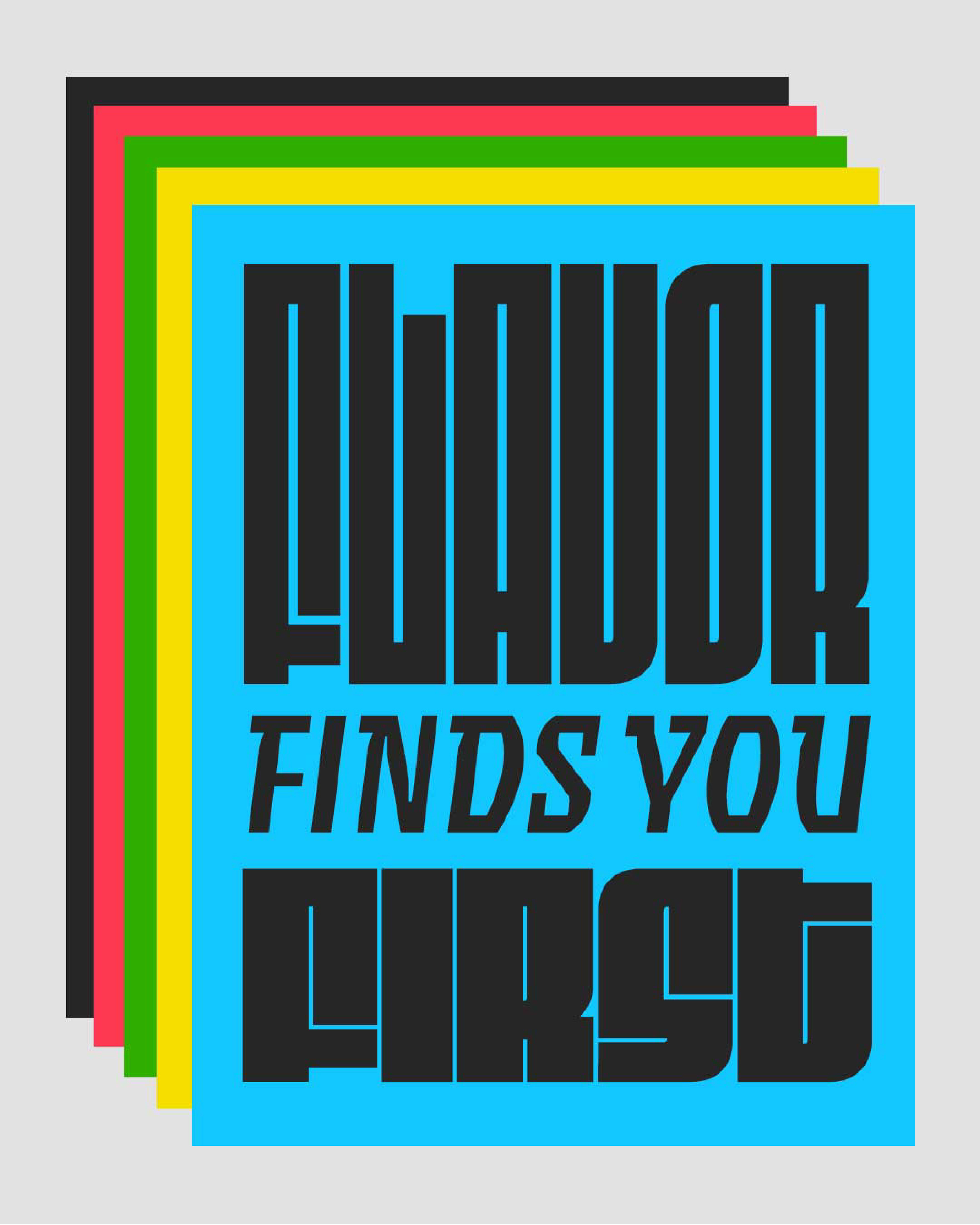
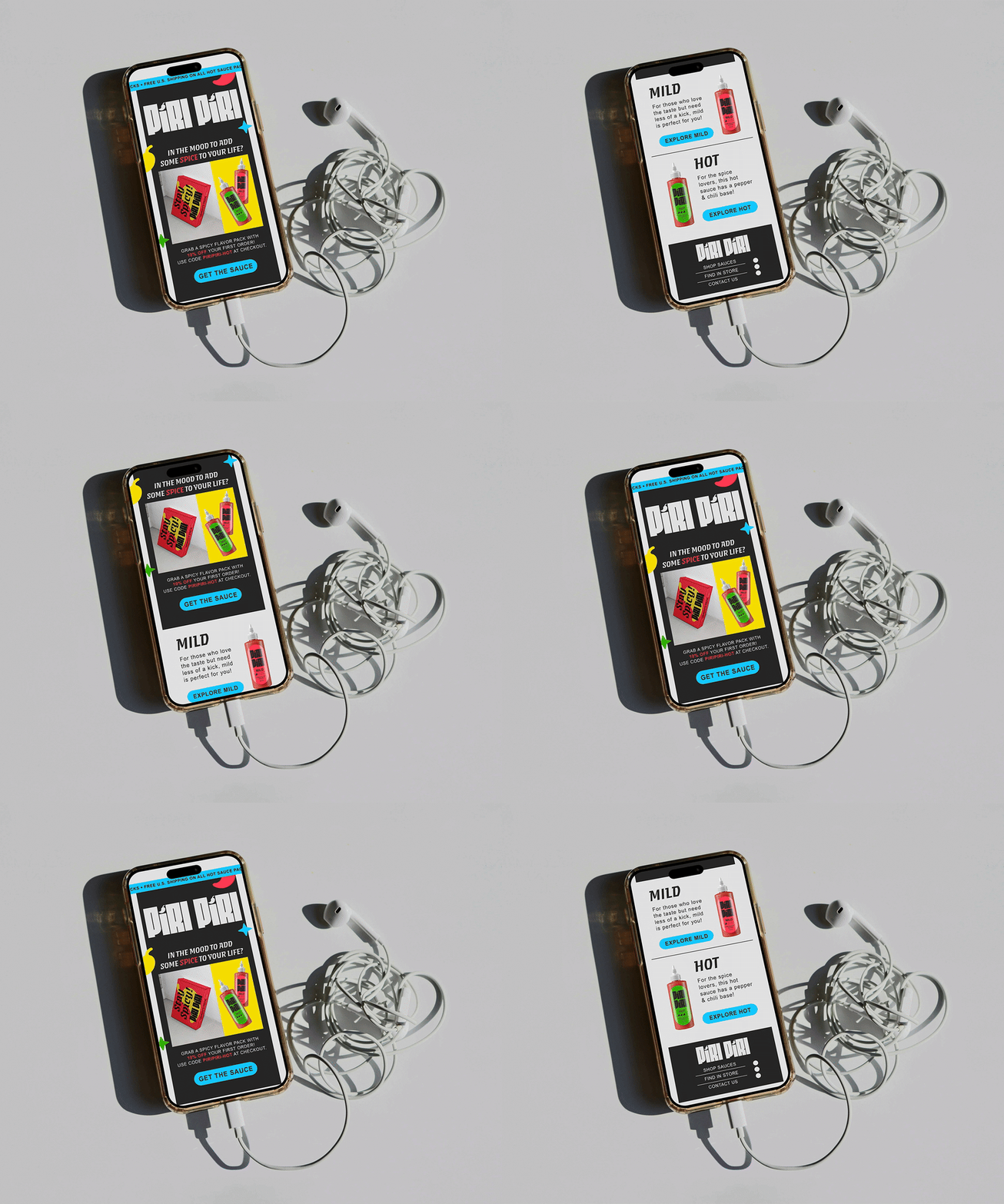
I wanted to lean into the BOLD aspect of the brand by using primary colors and high contrast typefaces. I used the chili icon as a patterning element as well as the dot of the I to add in some personality. I created a full logo suite, packaging, emails, and social posts to fully flesh out the brand and image what it's presence would look like online.